The admissions funnel · Graduate
A pile of bars became a funnel you can actually follow
The legacy "admission summary" stacked four disconnected bars with no sense of flow. You could read the four numbers, but not the story between them. The redesign turns the same figures into a funnel, so the drop from applied to enrolled, and where applicants fall away, reads straight down with the conversion at each step.
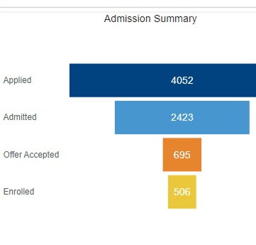
Admission funnel
Applied100%
Admitted60% admit
Accepted29% of admits
Enrolled73% of accepts
Each step shows the count and how much converts from the one above.
Four numbers, now a story about where applicants drop off.