Workforce composition · HR
A donut ringed with scattered labels, redrawn to be read
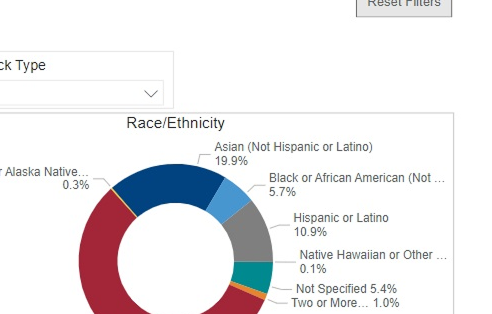
Race and ethnicity sat in a donut with eight labels flung around its edge in every direction, so comparing groups meant reading clockwise and squinting at leader lines. The redesign keeps a compact donut for shape but moves the breakdown into a sorted, labelled list beside it.
Race & ethnicity
White 56.8%
Asian 19.9%
Hispanic / Latino 10.9%
Black / African American 5.7%
Not specified 5.4%
Other 1.3%
Donut for shape, sorted list for the read. No leader lines to chase.
Same composition, now legible without circling the chart.