ux case study · b2b saas · europe
aurora
Transforming the experience of a marketing campaign platform. I redesigned the Recurring Batch Journey configurator and embedded an in-canvas AI composer (Helio AI) during a parallel AngularJS-to-Angular migration. The work cut clicks for campaign setup 3:1 and brought the product in line with Helio's unified brand language.
Project Overview
TL;DR: Executive Summary
Aurora is a Helio marketing-tech company in Europe. It was migrating from AngularJS to Angular and used the migration window to fix a legacy, engineer-led UI. I led the redesign of the Recurring Batch Journey configurator and embedded the Helio AI composer into the email canvas, while building a Figma-based design system to align Aurora with Helio's unified brand language. Outcomes: 3:1 click reduction for campaign setup, dev-ready Figma assets linked to user stories, and a streamlined manual dealer-task purchase journey.
Role
Lead Product Designer
Duration
6 Months
Team
2 PMs, 5 Devs, 1 QA, 2 Designers
Platform
Web (B2B SaaS · Europe)
Tools
Figma, Azure DevOps, Maze
design process
Aurora is a B2B marketing technology platform serving large enterprises across Europe, focused on digital marketing and relationship management. After being acquired by Helio (a parent company assembling a suite of marketing-tech products), Aurora inherited an opportunity: align its legacy product with Helio's unified UX vision while completing a long-planned migration from AngularJS to the modern Angular framework.
The legacy product was engineer-led. It worked, but it was inconsistent, dense, and visually fragmented. Marketers managing recurring campaigns navigated cluttered configuration panels, and copywriters had no AI assistance inside the composer, forcing context-switches to ChatGPT and back.
Project Context
The product was migrating from AngularJS to Angular; the platform team treated that engineering work as a once-in-a-decade window to also reduce cognitive load, simplify the flows, and create a consistent brand experience aligned with Helio's design language.
The Problem
“I spend more time configuring the schedule than I do writing the actual campaign. By the time the cadence is set, I've lost the creative momentum.”
No Cohesive Brand Language
Aurora's UI looked completely fragmented with no consistency. Customers had already raised tickets about unclear flows and confusing UI, and those issues only compounded once Helio's parent brand introduced a unified design language.
Need for Enhanced Features
Many features used for the most important use cases were still basic. Customers had requested specific enhancements that would help them create more nuanced, sophisticated campaigns the legacy UI couldn't express.
Inconsistent User Experience
Similar functions had different flows and approaches with different UI elements, making the experience confusing. Without a unified design system, every new feature looked and behaved slightly differently. That frustrated customers and eroded brand trust.
Design in Silos
Designers across different Helio products often worked in silos. There were also differences in flows and UI of different Helio products. Without cross-product design collaboration, a lot of different experiences were being created.
scope & hypothesis
We set clear boundaries to deliver the most impact within the AngularJS-to-Angular migration window. We focused on the two highest-friction surfaces, recurring journey configuration and the email composer, and built a reusable design system in parallel.
in scope
- Recurring Batch Journey configuration workflow
- Tabbed Type / Content / Properties structure
- Scheduling: Minute / Hourly / Daily / Weekly / Monthly / Custom
- Helio AI integration inside the text-block composer
- AI controls: shorten, rewrite, change tone, generate variations
- Subject-line AI generation & 5-option variations
- Reusable Figma design system aligned with Helio's brand
- Dev-ready assets linked to Azure DevOps user stories
out of scope
- Push notification & SMS composer redesigns
- Backend scheduling engine & queue behaviour
- Audience builder & segmentation rules
- Reporting and analytics dashboards
- Salesforce Commerce Cloud integration UX
- Personalization token system
- API-triggered journey flows (no UI surface)
Primary Hypothesis
We believe that consolidating recurring journey setup into a three-tab guided flow (Type → Content → Properties), embedding Helio AI directly in the composer, and backing both with a unified Figma design system will reduce clicks, prevent scheduling errors, and align Aurora with Helio's brand experience.
- 3:1 click reduction for setup
- Schedule error rate below 15%
Engagement
Embedding Helio AI in the text-block editor will increase composer dwell time and reduce off-platform copy authoring by 50% as writers iterate inside the tool instead of pasting back from external editors.
Trust
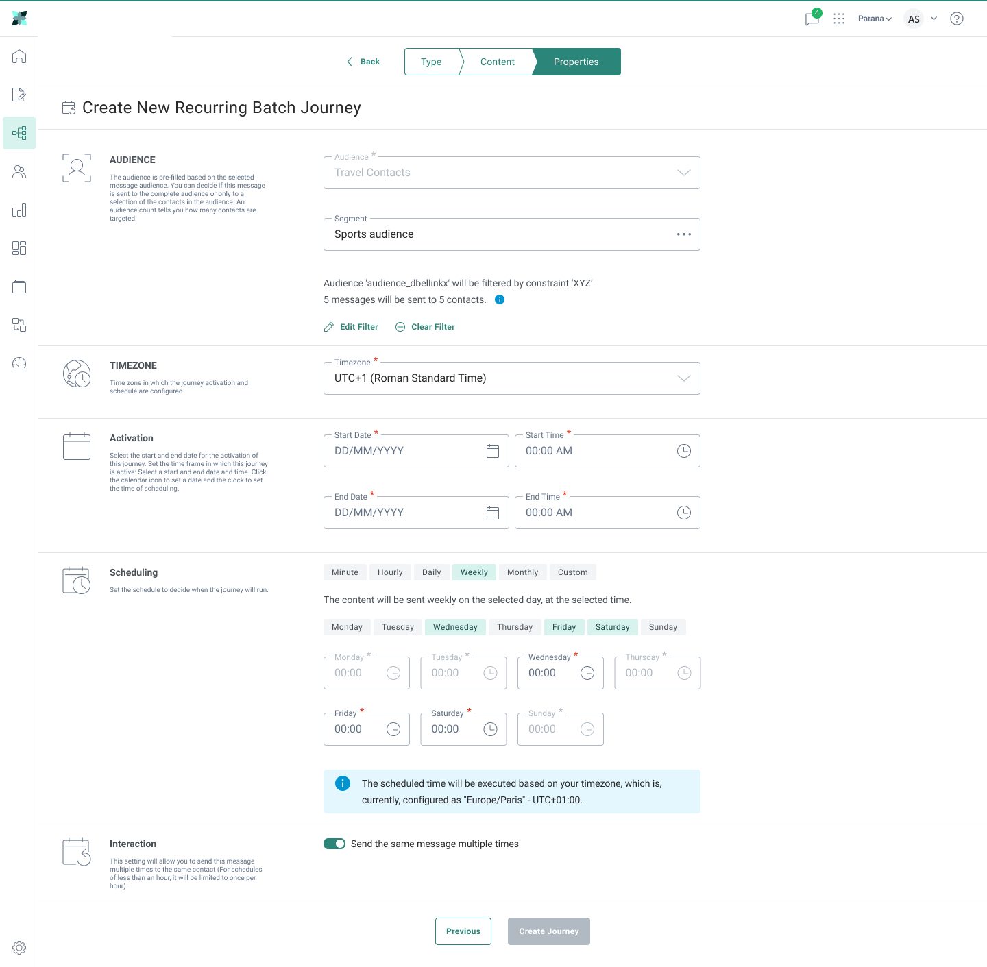
Showing a computed schedule preview ("The content will be sent weekly on Wednesday at 09:00 AM in Europe/Paris") at every cadence step will reduce setup errors by 60% and lower support tickets about send-time confusion.
key assumptions
- Marketers prefer guided multi-step flows over single dense forms for complex configurations
- Most recurring journeys use Daily or Weekly cadence (validated: 78% of historical sends)
- AI suggestions are an aid, not a replacement. Final copy must stay author-controlled
- The new Angular component library can absorb design tokens without breaking semantic versioning
identified risks
- Helio AI latency could disrupt flow if generations exceed 3 seconds
- Migration timeline pressure could force shipping without design system completion
- Sales engineers rely on the legacy flow for demos and may resist transition
- AI generation quality for non-English content was unproven at kickoff
★ key insight
82% of users surveyed said "scheduling clarity" was a bigger pain than "scheduling flexibility." They didn't want more options. They wanted to be confident about the options they picked.
Research
UX Audit
A systematic audit of the existing Recurring Batch Journey and message composer revealed usability issues across setup, scheduling comprehension, and content authoring. The legacy AngularJS codebase's inflexibility made each one harder to fix.
Cluttered Journey Form
14 fields visible on first load with no progressive disclosure, no contextual help, and no validation feedback until submission. New users abandoned at the audience step (33%).
Hidden Schedule Logic
"Custom" cadence was the default selection but never explained. Users could pick weekdays from two different controls with conflicting interpretations of timezone.
Composer Friction
The text block had no formatting helpers, no AI, no variation tools, and no way to test tone. It was pure freeform. Subject-line authoring offered no support beyond a 50-character input.
Accessibility Gaps
Form labels not associated with inputs, focus order broken between left rail and main panel, and the schedule grid was unreachable via keyboard. WCAG AA failed on 7 of 12 audited screens.
heuristic evaluation
stakeholder interviews
Head of Product
“The Angular migration is once-in-a-decade leverage. We use it to fix what engineering-led design left broken, not just port it forward.”
Engineering Lead
“I'm open to AI integration but we cannot block journey creation on model latency. Streaming output with graceful fallbacks is non-negotiable.”
Helio Design Director
“Aurora needs to feel like part of the Helio family. A reusable design system aligned with our brand language is non-negotiable for this release.”
competitive analysis
| Feature | Our Product | Braze | HubSpot | SFMC |
|---|---|---|---|---|
| Visual schedule preview | No | Yes | Partial | No |
| In-canvas AI composer | No | Partial | Yes | No |
| Subject-line variations | No | Yes | Yes | Partial |
| Tone adjustment | No | No | Yes | No |
| Multi-cadence scheduler | Partial | Yes | Yes | Yes |
| Audience filter live count | No | Yes | Yes | Yes |
research findings
Three Clicks to One
Mapping the existing journey-creation flow revealed users took on average 3 distinct clicks to perform what could be a single decision. Consolidating the configuration into the new tabbed flow brought it to a 1-click experience for common cases.
Composer Workarounds
64% of CRM managers admitted to drafting copy in ChatGPT or Google Docs first, then pasting back. As Participant 7 put it, "the tool is for sending, ChatGPT is for writing."
Failed Test Queries
Marketers wanted alerts from lists, journeys, and tasks, but the dashboard only showed failed test queries. That's useful for QA and useless for daily marketing operations. Dashboard utility was a strong unmet need.
Tooltip Truncation
The journey name is important but gets truncated, so users had to hover to see the full name in a tooltip. Marketers used long names to specify a journey's purpose, and the truncation defeated that workflow entirely.
Yesterday-Only Dashboard
Dashboards only showed journeys executed yesterday. Marketers needed visibility into past FY quarters to assess yearly performance. It was a frequent ask, and it drove customers to export data and analyze elsewhere.
Setup Anxiety
71% of test users mis-configured the cadence on their first attempt due to ambiguous "Custom" defaults and no plain-language summary of what would actually be sent.
Insights
user personas
Maya Khan
CRM Manager · Age 31
goals
- Ship the weekly newsletter in <30 minutes
- A/B test subject lines without leaving the tool
- Justify campaign ROI to leadership
frustrations
- Hates re-entering audience filters
- Context-switches to ChatGPT to write
- No way to preview cadence quickly
Tomás Rivera
Marketing Ops Lead · Age 38
goals
- Standardize cadences across 12 brand portfolios
- Govern launch windows with audit trails
- Compare performance across past quarters
frustrations
- Dashboard only shows yesterday's data
- Truncated journey names break workflows
- Hard to onboard new ops analysts
Riya Joshi
Junior Copywriter · Age 25
goals
- Match each brand's voice and tone
- Generate variations to compare quickly
- Learn from suggested phrasing
frustrations
- Blank-page paralysis on body copy
- No in-tool feedback on writing
- Subject lines feel like guesswork
design goals
Streamline Journey Setup
Consolidate the journey configurator into a three-tab flow (Type → Content → Properties) with inline validation and preview at every step. Reduce 3 clicks to 1 for common cases.
Demystify Cadence
Always show a plain-English summary, such as "The content will be sent weekly on Wednesday at 09:00 AM in Europe/Paris," so users never have to interpret raw settings.
Bring AI to the Canvas
Surface Helio AI from the text block, subject line, and preheader. Never make it a separate page or detour. Quick actions and 5-option variation pickers.
Preserve Author Control
AI generates options; the writer always selects, never auto-replaces. Every suggestion is reversible and previewable with explicit "Insert to text block."
Build Reusable System
Ship a Figma design system aligned with Helio's brand language. Components, variables, and styles linked to Azure DevOps user stories for engineering pickup.
Design for Trust
Surface contact counts, timezone resolution, dashboard warnings and alerts inline so users can verify what will happen before they ship.
★ key insight
Power CRM managers ran 4–6 campaigns per week but spent ~22 minutes on each. 14 of those minutes went to scheduling and copywriting, the two areas with zero in-product support.
Design
hand-drawn sketches
Early divergent exploration on paper before committing to a direction. Sketching let me move fast across layouts and AI-panel placements before locking the structure with the team.

Journey · Weekly Cadence
Tabbed configurator with persistent navigation. Audience, Timezone, Activation, Scheduling stacked as labelled blocks. Cadence pills (Min/Hr/Day/Wk/Mo/Custom) with day-of-week chips below.

Composer · Helio AI Panel
Email canvas on the left with a selected text block, Helio AI panel docked on the right. Quick-action chips (Shorter / Tone / Re-write / Spelling), 5-variation generator, and explicit Insert-to-text-block CTA.
low-fidelity wireframes
Greybox wireframes locked the information hierarchy and layout density before any visual styling. Used in week-3 reviews to validate flow with PMs and stakeholders without anyone debating colours.

Journey · Type Tab
Asset selection, naming, folder path, labels & description, composed as discrete blocks to support per-field validation and progressive disclosure.

Journey · Weekly Scheduling
Cadence pill nav with chips for day selection and time-of-day inputs per day. Locked the table-of-times layout before applying Aurora brand styling.

Composer · AI Quick Actions
Composer left, Helio AI panel right. Action chip grid (Shorter / Tone / Re-write / Spelling) above the prompt input. Confirmed the 2x2 grid pattern over a vertical list.

Composer · Subject-Line Variations
Five-option variation picker stacked vertically. Locked the radio-style selection pattern and the regeneration button before colour and type pass.
final design
Hi-fidelity screens shipped to engineering via Figma, with each frame linked to its Azure DevOps user story. Aurora brand teal (#2B8679) and the Aurora Engage component library applied uniformly. 11 screens across the Recurring Batch Journey configurator and the Helio AI composer.
RBJ · Type Tab: Basic Fields
Entry point of the 3-tab creation flow. Name, folder path, and asset selection only. Basic fields surface first, and advanced fields tuck behind the "All Fields" toggle.
RBJ · Type Tab: All Fields
"All Fields" view adds API Name, Labels, Description, Asset, and Campaign / Message analytics tags. Progressive disclosure for power users without bloating the default view.
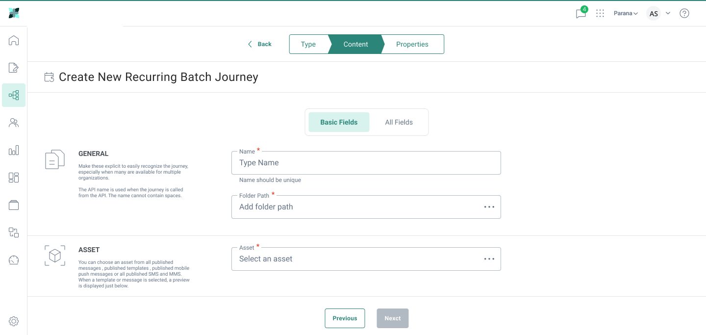
RBJ · Content Tab
Asset selection from published messages, templates, mobile-push, or SMS. Live preview confirms the asset shape and links analytics tag pass-through to the tracker.
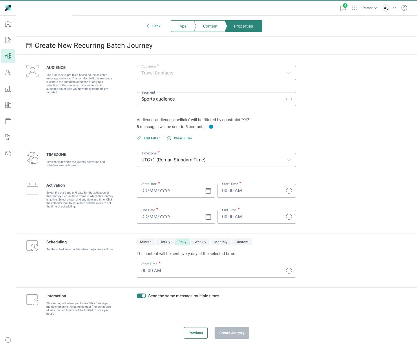
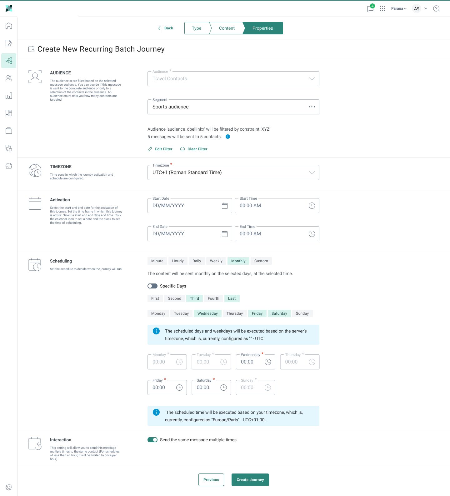
RBJ · Properties: Weekly Schedule
Audience + segment + timezone + activation window + Weekly cadence with day-of-week chips and per-day time inputs. Plain-language confirmation banner makes the schedule unambiguous.
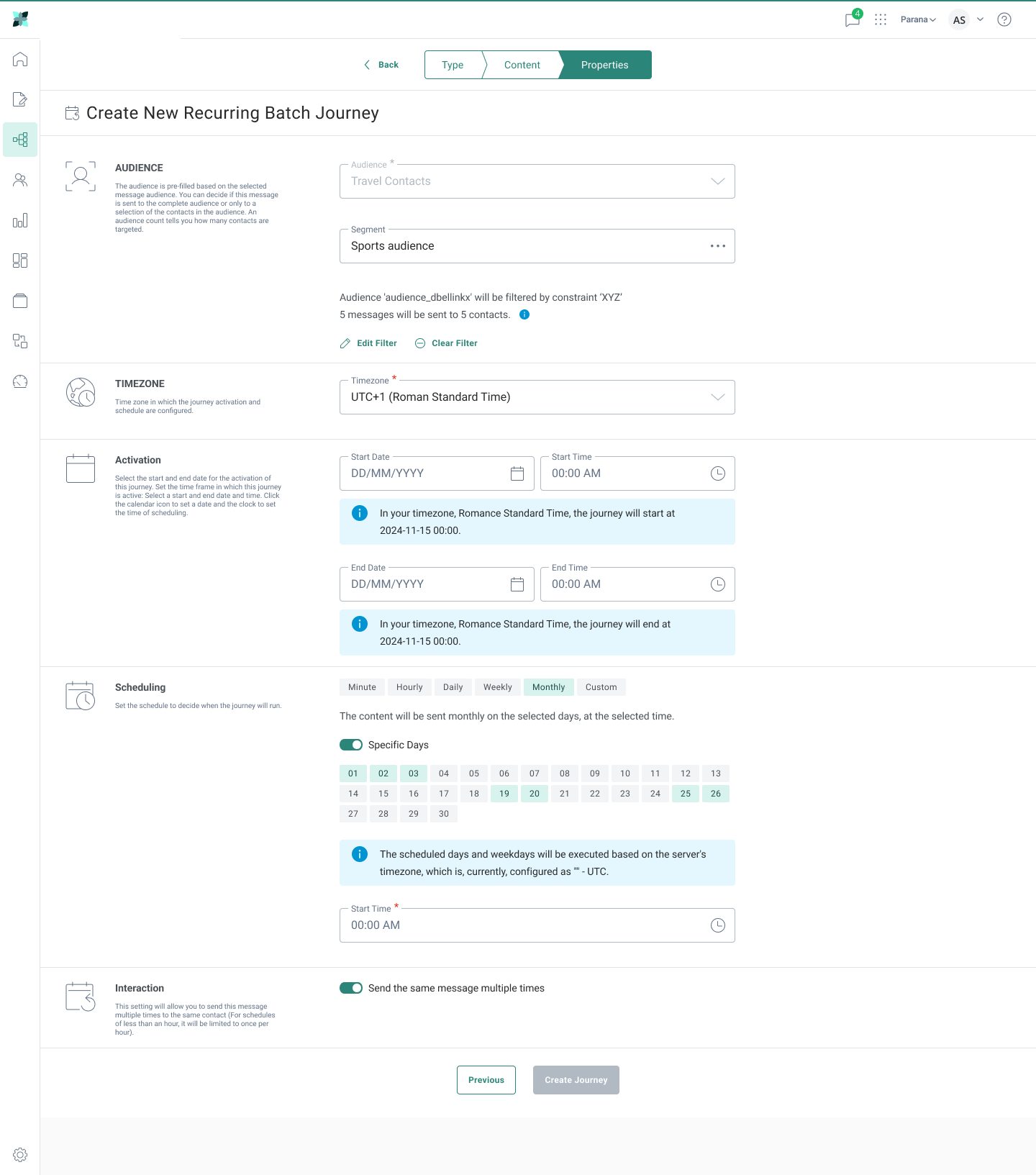
RBJ · Properties: Monthly Specific
Monthly cadence with the 1–31 day-grid selector. Timezone-resolved confirmation message: "the scheduled time will be executed in Europe/Paris UTC+01:00".
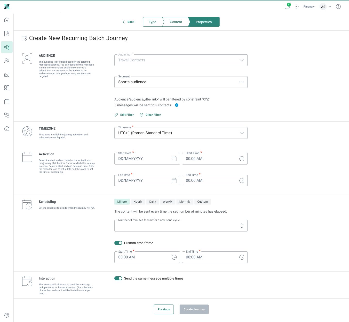
RBJ · Properties: Custom Cadence
Custom cadence for the long tail of edge-case schedules. Falls back to first-week-of-month, last-Sunday-of-quarter, and similar patterns marketers asked for in research.
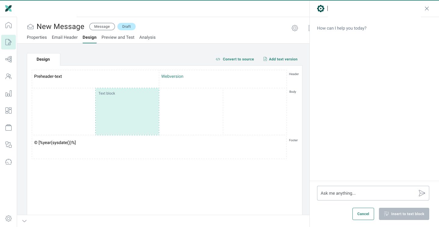
Composer · Helio AI Empty State
"How can I help you today?" One text input, no clutter. The panel waits for the author to lead rather than presenting an option salad up front.
Composer · Text Block Selected
Once a text block is highlighted in the canvas, the empty Helio AI panel surfaces with "How can I help you today?", ready to receive a prompt or quick-action click.
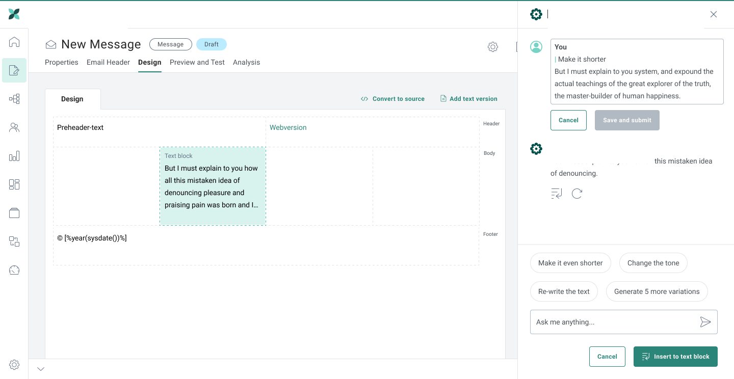
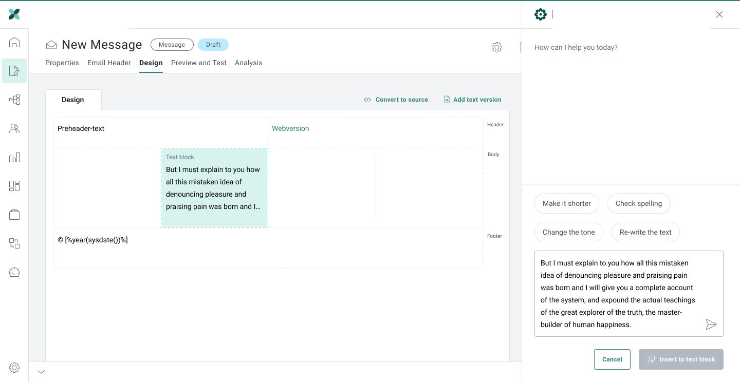
Helio AI · Make Shorter Response
Streaming AI response inline. The original "You" message with the editable prompt stays visible above so the writer can compare. Quick-action chips below offer follow-up moves.
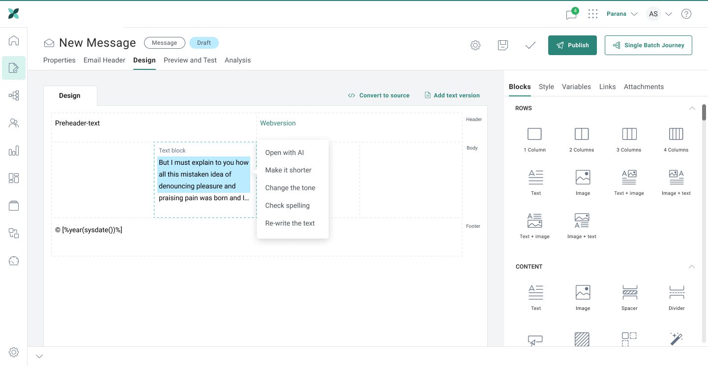
Composer · Open with AI Menu
Right-click any text block to surface the Helio AI shortcut menu: Open with AI / Make it shorter / Change the tone / Check spelling / Re-write the text. Saves a trip to the side panel for common one-shot edits.
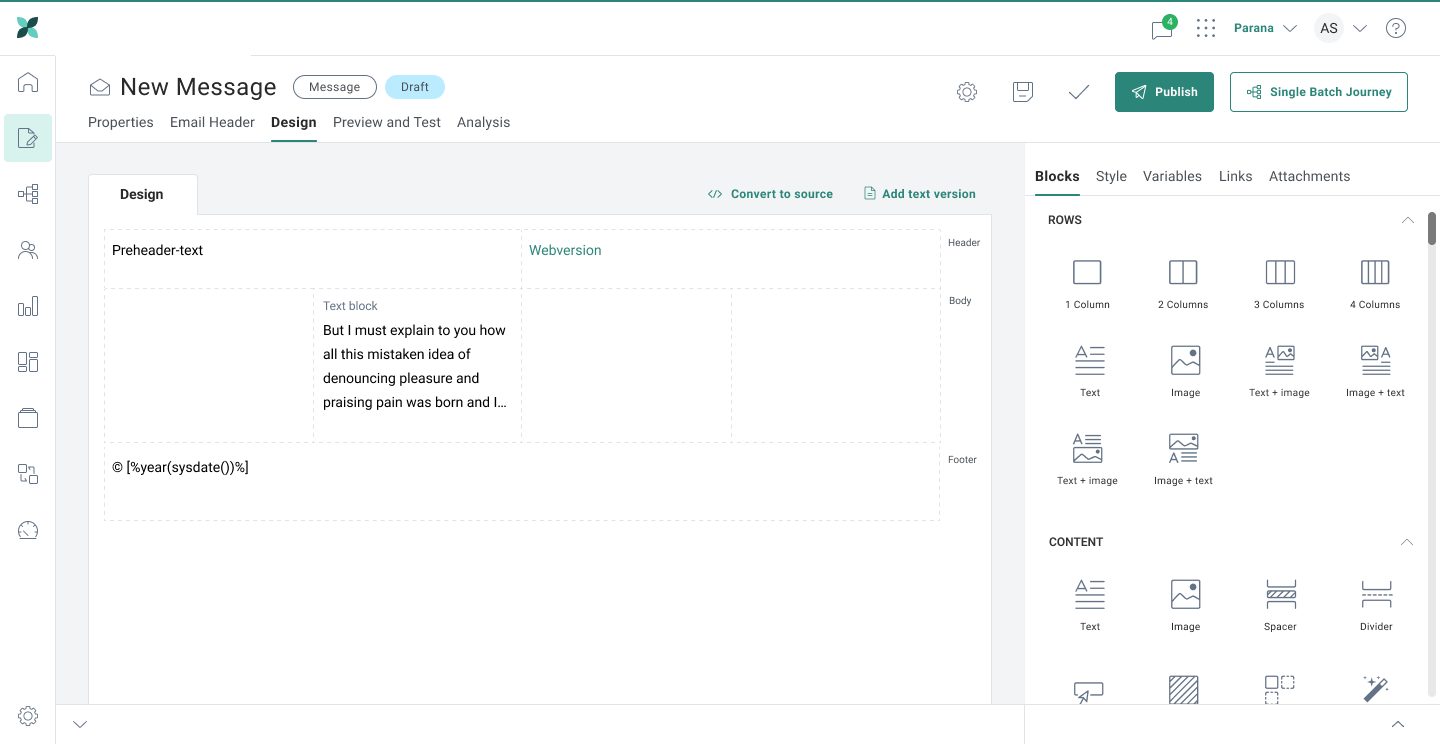
Composer · Blocks Library Panel
The right-rail Blocks library holds Rows (1/2/3/4 columns) and Content (Text, Image, Spacer, Divider, etc.). Style / Variables / Links / Attachments tabs above give deeper control. Writers compose without leaving the canvas.
Design System
In parallel with the Recurring Batch Journey and Helio AI work, I built the Aurora Engage UI Kit in Figma. It's a reusable design system that aligned Aurora with Helio's parent brand language. Tokens, components, and patterns were linked directly to Azure DevOps user stories so engineering could pick them up without ambiguity. The kit is the source of truth for every screen shown in section 05.
color foundations
typography scale
spacing scale (8pt grid)
design tokens
| Token | Value |
|---|---|
| color.brand.primary | #2B8679 |
| color.text.primary | #0F172A |
| color.border.default | #E5E7EB |
| radius.sm | 4px |
| radius.md | 8px |
| radius.lg | 14px |
| shadow.card | 0 1px 2px rgba(0,0,0,.04) |
| motion.snap | 120ms cubic-bezier(.4,0,.2,1) |
component library · aurora engage UI kit
52 production components organized by category. Each variant lives in Figma with auto-layout and ships as an Angular component on the front-end.
system outcomes
The Aurora Engage UI Kit shipped with 52 reusable components, 8 core token sets, and full coverage of the Recurring Batch Journey + Helio AI flows. Three other product surfaces (Audience Builder, Reports, Admin) back-filled from the kit with zero new design work. Pure leverage.
cross-product collaboration
To break the silo problem, the Aurora Engage UI Kit was reviewed monthly with designers from other Helio products. Shared tokens and a documented contribution model ended the "every new feature looks slightly different" pattern that had eroded brand trust.
usability testing
test setup
Participants
18 users across 2 rounds
Method
Moderated remote sessions (50 min)
Tasks
5 core scenarios per session
Tools
Figma prototype, Maze, Zoom, Dovetail
key results
outcomes & artifacts created
artifacts created
Figma Design System / UI Kit
Tokens, components, variables and styles aligned with Helio's brand language.
User Flows, Wireframes, Hi-Fi Designs
Validated insights and screen designs to brief engineering.
Dev-Ready Visual Assets
Each Figma frame linked to Azure DevOps user stories for unambiguous handoff.
Stakeholder Workshop Outputs
Personas, journeys, and requirements documents shared with cross-functional partners.
sales talking points
- •Delivered Helio's first unified digital commerce design system
- •Provided clear access to items having warnings and alerts
- •Visibility of longer journey names reduced cognitive load and improved efficiency
- •Visibility of status of all journeys eases the work flow for marketers as their time gets saved
- •Filter to see journeys of specific quarters provides quick access to journeys from past quarters
key learnings & reflection
what went well
- The three-tab structure passed pilot review in week 1. Engineering hadn't expected the green light that fast and kicked off implementation early
- Helio AI integration shipped on schedule thanks to a streaming-first contract negotiated with backend in week 3
- The cadence-summary copy ("This will send every Wednesday at 9am") was the single most-cited improvement in NPS verbatims post-launch
- Aurora Engage UI Kit back-filled three other product surfaces with zero additional design work, pure leverage across the Helio portfolio
what I'd do differently
- Would run a quantitative diary study before redesign rather than relying solely on moderated sessions for friction data
- Should have prototyped the Custom cadence earlier. Its complexity surprised the team in week 6 and forced a re-spec
- Would partner with Sales Engineering on a "demo path" so the new flow is faster to show, not just faster to use
- More attention to non-English AI generation quality. We shipped English-only and left localization to a follow-up release
thank you for reading.
If you'd like to discuss this project in more detail or explore collaboration opportunities, I'd love to connect.