ux case study · featured
finvista
Re-imagining a digital lending platform for quick, hassle-free finance, serving millions across urban and rural India.
Designing a scalable lending experience for India's next billion borrowers
FinVista is a consumer-facing digital lending platform operated by a leading Indian NBFC, a subsidiary of one of India's largest automotive conglomerates. The platform serves customers across 500+ cities, offering loans for two-wheelers, consumer durables, personal needs, used vehicles, tractors, and more.
TL;DR: Executive Summary
I led the UX design of a native Android Loan Origination System for a leading Indian NBFC, covering 6 loan product journeys with a focus on the Two-Wheeler flow. Through competitive analysis, persona development, and 5 rounds of iterative prototyping, I created a scalable design system with 100+ components and turned a complex, paper-heavy loan application into an 11-step digital journey. The result was faster processing, less reliance on agents, and higher completion rates.
Role
Sr. UX Lead
Duration
5 Months
Team
2 Designers, 1 PM, 8 Devs
Platform
Native Android App
Tools
Figma, FigJam, JIRA
Scope
End-to-End LOS
design process
product landscape
The platform supports six distinct loan products, each with its own journey flow. I designed all six, but this case study focuses on the Two-Wheeler (TW) Loan, the highest-volume product.
Two-Wheeler Loan
Loans for new and used two-wheelers: bikes, scooters, electric, and mopeds. Available via agent-assisted or customer DIY flows. The highest-volume product.
Consumer Durable Loan
Financing for mobiles, refrigerators, and washing machines. Completed by agents in stores or via customer-initiated DIY scheduling.
Cross-Sell Personal Loan
Pre-approved personal loans for existing customers based on eligibility. Assisted or self-service via the app.
Used Car Loan
Financing for used four-wheelers, available for agents and customers. Supports new and existing customer onboarding.
Tractor Loan
Comprehensive financing for brand-new tractors with up to 90% funding and streamlined documentation.
Three-Wheeler Loan
Financing for new three-wheelers via dealership agents or customer self-service.
A lending platform that needed to work for everyone, from tech-savvy urbanites to first-time borrowers in rural India
The NBFC's existing loan process was paper-heavy, agent-dependent, and fragmented. The challenge: design a native Android app that served multiple user personas and loan products, scaled across urban and rural markets, and stayed compliant with regulation throughout.
core challenge
Design a native Android application with a scalable structure, dynamic reusable components, and a future-proof solution that enhances accessibility and user experience across all types of smartphones and devices.
problem dimensions
Multi-Persona Complexity
Three distinct user groups: customers (DIY), sales centre executives, and dealership agents. Each had different goals, technical literacy, and interaction contexts.
Information Overload
Loan applications involve 40+ data fields across personal details, KYC, employment, income, vehicle selection, and bank verification. Presenting this on mobile without overwhelming users required careful IA.
Device & Network Diversity
Users range from latest flagships on 5G to entry-level Android devices on 2G connections in rural areas. The app needed to perform reliably across this entire spectrum.
Trust & Security
First-time borrowers are cautious about sharing financial information digitally. The interface needed to build trust at every step while complying with RBI regulations.
Product Scalability
Six distinct loan products, each with different data requirements and eligibility criteria, needed a shared component foundation that still left room for product-specific variations.
Accessibility Gaps
A mobile-first approach has drawbacks for complex processes like loan applications: discoverability, varied user preferences, performance, and technical constraints.
scope definition
in scope
- End-to-end loan origination for 6 products
- Two-Wheeler journey as primary focus
- Native Android design system
- Agent and customer (DIY) pathways
- KYC, identity verification, consent flows
- Scalable component library (100+ components)
- Dashboard and application management
out of scope
- Backend credit scoring algorithms
- Payment gateway integration UI
- Admin panel and back-office tools
- Marketing website and landing pages
- Post-disbursal loan management
- Third-party API integration logic
Understanding the lending landscape through competitive analysis and stakeholder discovery
I conducted a comprehensive competitive analysis of leading digital lending apps in India, combined with stakeholder interviews and a heuristic evaluation, to identify patterns, gaps, and opportunities for differentiation.
competitive analysis
Analyzed the UX patterns, IA, and interaction design of five leading lending apps to identify best practices and opportunities.
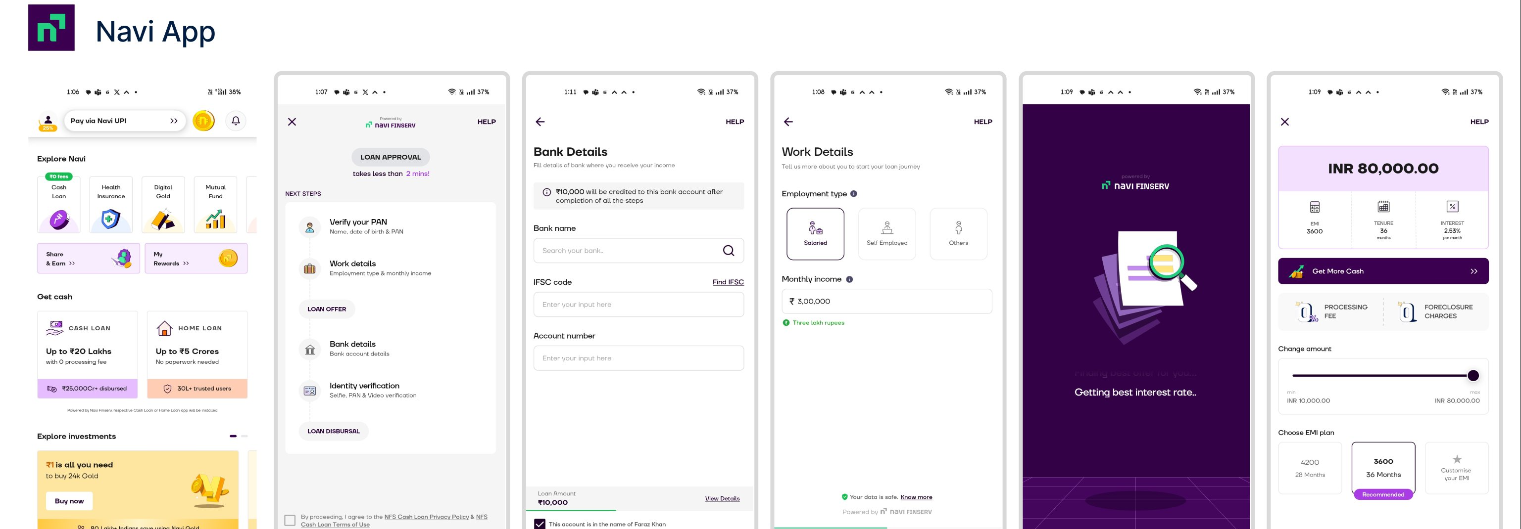
Navi
Clean UI, contextual navigation, one-step-at-a-time approach, intuitive micro-interactions and animations.
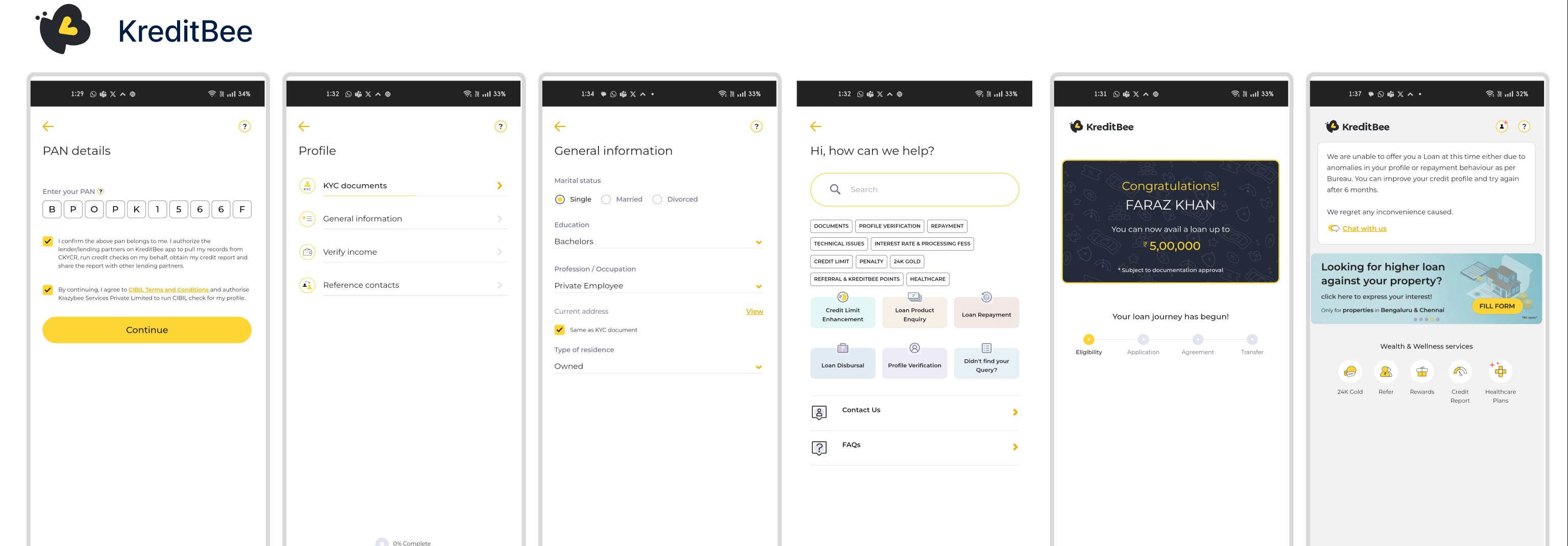
KreditBee
Step-by-step onboarding, progress tracking, categorized information, help always available mid-journey.
findings across 5 competitors
| Pattern | Navi | KreditBee | Bajaj Finserv | Home Credit | Muthoot |
|---|---|---|---|---|---|
| Contextual navigation | ✓ | ✓ | ✓ | – | – |
| One-step-at-a-time | ✓ | – | ✓ | ✓ | – |
| Micro-assistive text | ✓ | ✓ | – | ✓ | – |
| Progress tracking | – | ✓ | ✓ | – | ✓ |
| Help always available | ✓ | ✓ | ✓ | ✓ | – |
| Future process indication | – | ✓ | – | – | – |
| Micro-interactions | ✓ | – | ✓ | – | – |
| Multi-product support | – | – | ✓ | – | – |
key insight
Competitors excelled at single-product lending flows, but none had solved the multi-product, multi-persona challenge at scale. That became our main opportunity: one flexible system serving 6 products and 3 user types instead of 6 separate apps.
design approach & considerations
Material Design Foundation
Use Material Design with card-based layouts for better adoptability across Android's dominant user base.
Clean & Minimalistic
Keep the visual language uncluttered. This matters most for users with limited digital literacy.
Contextual Graphics
Use illustrations and icons to provide context and reduce reliance on text-heavy instructions.
Visual Hierarchy
Consistent hierarchy for primary actions, titles, and informational content.
Progress Visibility
Show progress upfront so users always know where they are and what's coming next.
Intuitive Multi-color Icons
Multi-color icons for better recognition and a more engaging visual experience.
Two personas, one journey: bridging agent efficiency and customer empowerment
Research revealed two primary user archetypes whose needs shaped every design decision. The platform needed to serve both without forcing either into the other's workflow.
user personas
Rahul Sharma
Sales Centre Executive
“I am focused on delivering exceptional customer service and facilitating a smooth loan application process for existing customers, leveraging both phone support and the mobile app to provide personalized assistance and guidance.”
Challenges
- Technical Issues: May encounter glitches with the mobile app while assisting customers remotely. Needs reliable tech support and troubleshooting resources.
- Time Constraints: Often handles multiple customer inquiries simultaneously as a sales centre executive.
- Compliance & Security: Must ensure compliance with regulatory requirements and data security standards while assisting with loan applications.
- Training & Support: Requires ongoing training to stay updated on latest features, functionalities, and changes to loan policies.
Goals
- Efficient Assistance: Provide prompt and effective assistance to existing customers applying for a loan, ensuring a positive experience.
- Clear Communication: Explain complex terms and procedures in a simple, understandable manner.
- Personalized Service: Tailor loan options and recommendations to each customer's unique financial needs and circumstances.
- Seamless Integration: Seamless phone-to-app integration with access to customer information and application status updates in real-time.
Ankita Agarwal
Customer (First-time Borrower)
“I am looking for financial help via a transparent service that makes the loan application process convenient and efficient for my busy lifestyle.”
Challenges
- Security Concerns: Cautious about sharing personal and financial information online. Expects robust security measures to protect her data.
- Understanding Loan Terms: As a first-time applicant, not familiar with financial jargon. Needs clear explanations of terms and conditions to make informed decisions.
- Customer Support: Expects prompt and helpful support through the mobile app for any questions or issues during the application process.
Goals
- Convenient Access: Hassle-free loan access without visiting a physical branch. Values convenience and efficiency in financial transactions.
- Transparency: Clear information about interest rates, repayment terms, and any associated fees throughout the process.
- Quick Approval: Quick approval and disbursement of loans for urgent, unexpected expenses.
- User-Friendly Interface: Intuitive interface with easy navigation to complete the application process without confusion.
design principles
Progressive Disclosure
Break complex data entry into focused, single-purpose screens. One category of information at a time to reduce cognitive load.
Information Chunking
Group related fields as digestible chunks. KYC, employment, and income details each get their own step.
Assistive Context
Micro-copy and contextual explanations at every step. First-time borrowers should never feel lost.
Trust at Every Step
Data security badges, transparent consent, and clear explanations of why each piece of information is needed.
Dual-Mode Flexibility
Agent-assisted and customer DIY flows. Agents need speed; customers need guidance. Same system, adaptive UX.
Scalable Patterns
Every component works across 6 loan products. Design for the most complex (TW), simplify for others.
Mapping the Two-Wheeler loan journey from entry to disbursement
The TW loan application is structured as an 11-step journey, bookended by onboarding and post-submission processing. Each step is a focused, single-screen interaction with clear progress indication.

Two-Wheeler loan journey: 11-step application flow from welcome to disbursement
user tasks by step
Personal Details
Name, DOB, gender, marital status, live photo capture
PAN Verification
PAN card or Form 60 verification and validation
Address Details
Residence type, landmark, and pin code
Employment Details
Employment type, company name, and landmark
Income Details
Applicant income and total household income
Product Details
Vehicle type, make, model, scheme selection
Schemes & VAS
Add-ons: InstaCard, Credit Shield, extended warranty
Bank Account
UPI ID, bank account, and mandate setup
Photo & Documents
Document capture and live photo verification
Notifications & Consent
E-consent and communication preferences
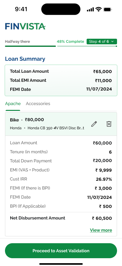
Loan Summary
Review all details and submit application
From wireframes to production: the Two-Wheeler journey
The design evolved through three distinct phases: low-fidelity wireframing to validate information architecture, mid-fidelity explorations to test visual approaches, and high-fidelity final screens refined through stakeholder feedback.
wireframes
I built structured low-fidelity wireframes across the entire journey to validate information architecture and gather feedback before investing in visual design. Three batches covered onboarding, application flow, and post-submission states, 12 wireframes in all.


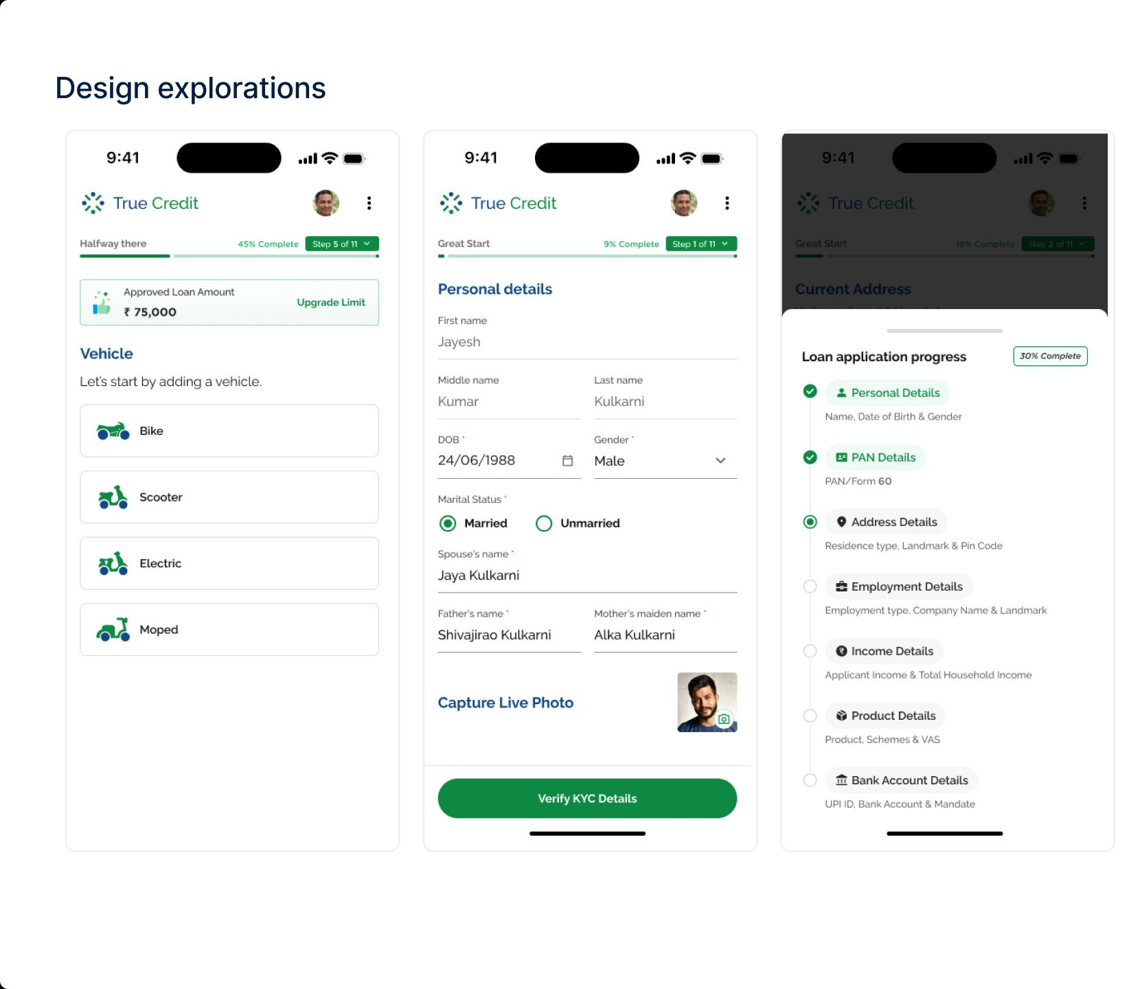
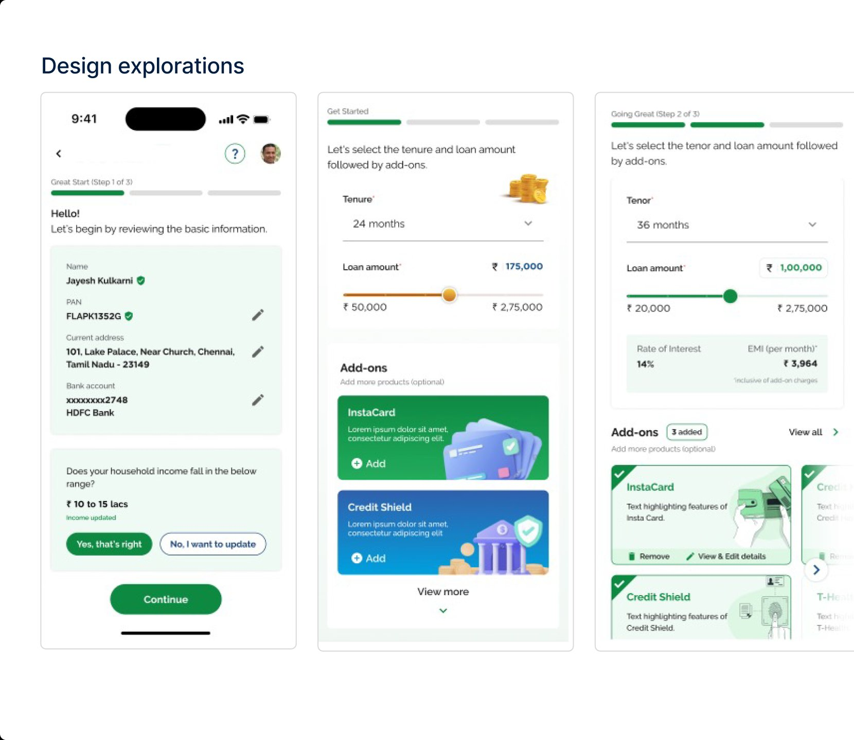
design explorations
After wireframes, I explored several visual approaches, testing flat vs. 3D icons, input field styles, and layout density. I reviewed each variant with stakeholders and iterated on their feedback.
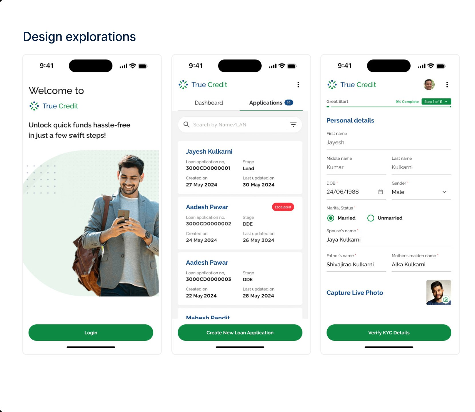
final design: the two-wheeler journey
The finalized UI across 17 key screens, from login to disbursement. Each screen follows the no-scroll, single-action pattern with information chunking and dual progress indicators.
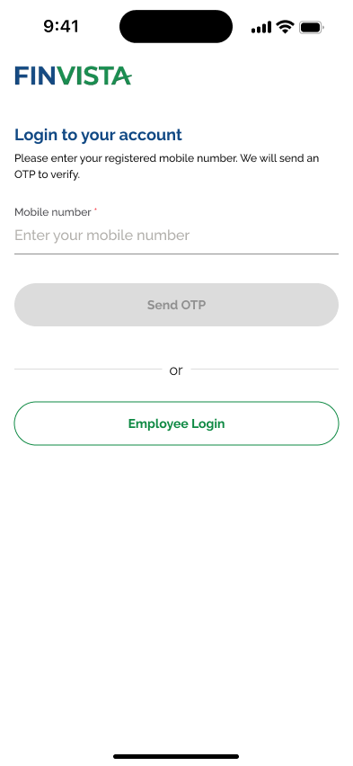
Login & Authentication
Mobile number entry with OTP verification. Employee login fallback for sales executives.
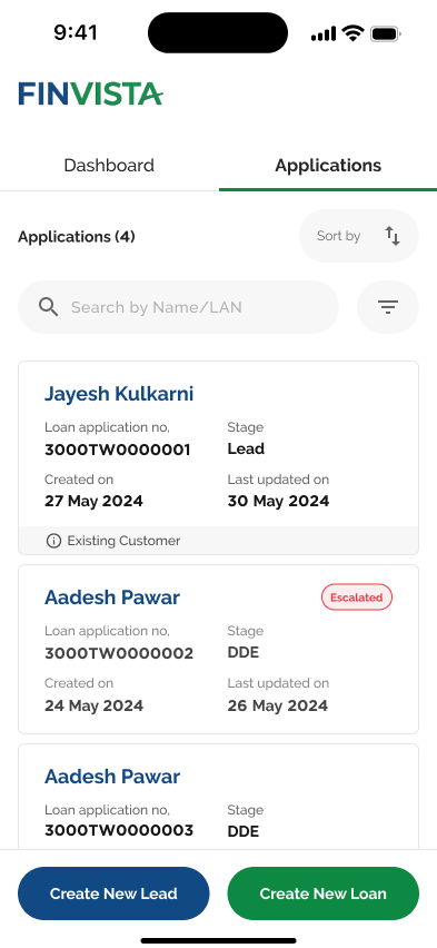
Applications Dashboard
Search, sort, filter. Status badges (Lead, DDE, Escalated) with quick access to applications.
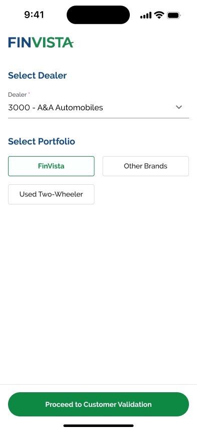
Dealer & Portfolio
Sales executive flow. Dealer and portfolio selection before starting the customer journey.
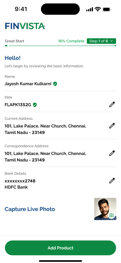
Personal Details
Pre-verified KYC data with edit affordances. Live photo capture inline. Dual progress system.
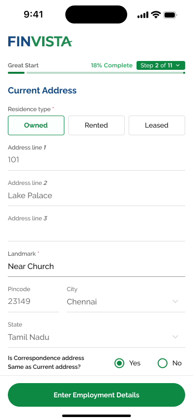
Address Details
Current address with pin code auto-fill, residence type chips, and landmark assistance.
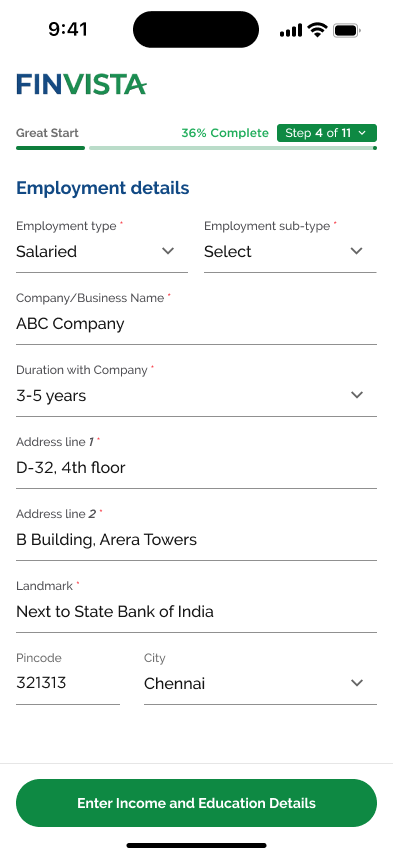
Employment Info
Employment type chips, company details, and income capture with currency formatting.
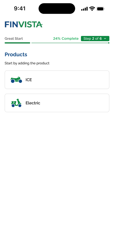
Vehicle Selection
Visual chip selection for ICE vs Electric. Icon-led interface for recognition.
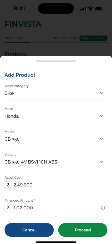
Product Config
Bottom sheet for Make/Model/Variant with asset cost and financed amount.
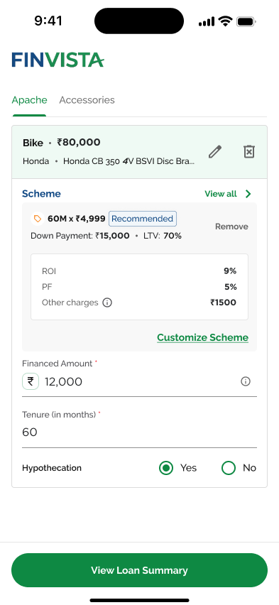
Scheme Selection
Recommended scheme upfront. ROI, PF, charges breakdown with customization options.
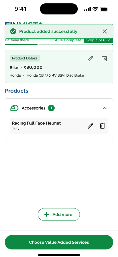
Add-On Products
Accessories like helmets and gear. Bundled financing simplifies the purchase decision.
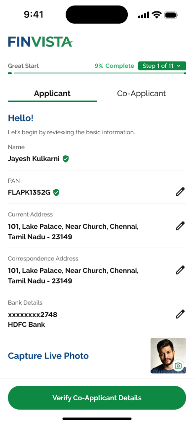
Co-Applicant
Choose existing relationships or add new. Strengthens eligibility for first-time borrowers.
Loan Summary
Complete breakdown of amount, EMI, tenure, and IRR. Transparent for trust-building.
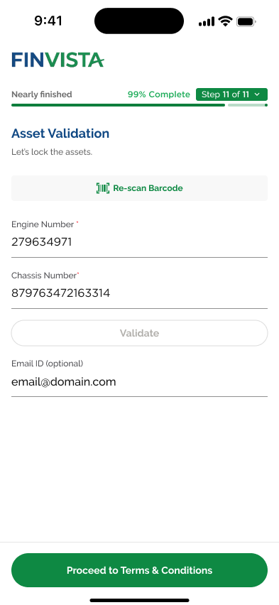
Asset Validation
Engine and chassis number with barcode scan. Locks the physical asset to the loan.
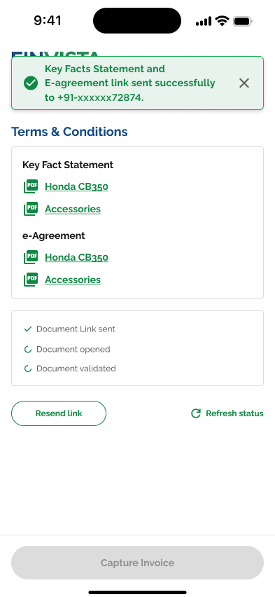
KFS & E-Agreement
Digital signature with OTP. Real-time document tracking status.
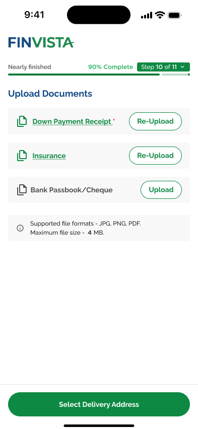
Document Upload
Down payment, insurance, passbook upload with re-upload and format guidance.
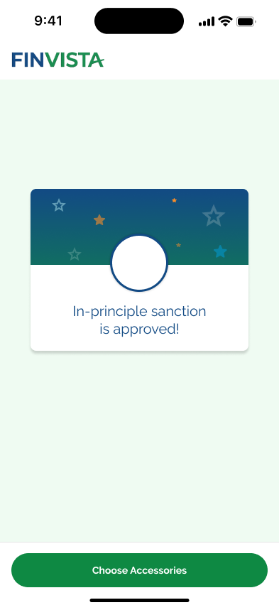
Soft Approval
Instant approval with celebratory micro-interaction. Next steps guidance.
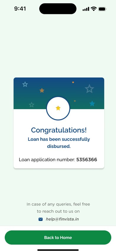
Disbursement
Final success state with application number and support contact.
key design decisions
No-Scroll Screen Design
Adopted a no-scroll approach presenting precise, relevant information on a single screen. This reduced cognitive overload and created a focused interaction model, which mattered for agents processing 15–20 applications daily.
Dual Progress System
A two-tier progress indicator: top-level percentage bar ("45% Complete") plus step-level indicator ("Step 5 of 11"). Keeps users oriented without overwhelming them with the full scope upfront.
Assistive Onboarding
Each step opens with supportive messaging: "Hello! Let's begin by reviewing the basic information." Conversational tone reduces anxiety for first-time borrowers navigating a bureaucratic process.
Pre-verified Data Display
For existing customers, pre-populated fields display with verification checkmarks and edit icons. One-tap confirmation ("Yes, that's right") or update option reduces friction for repeat borrowers.
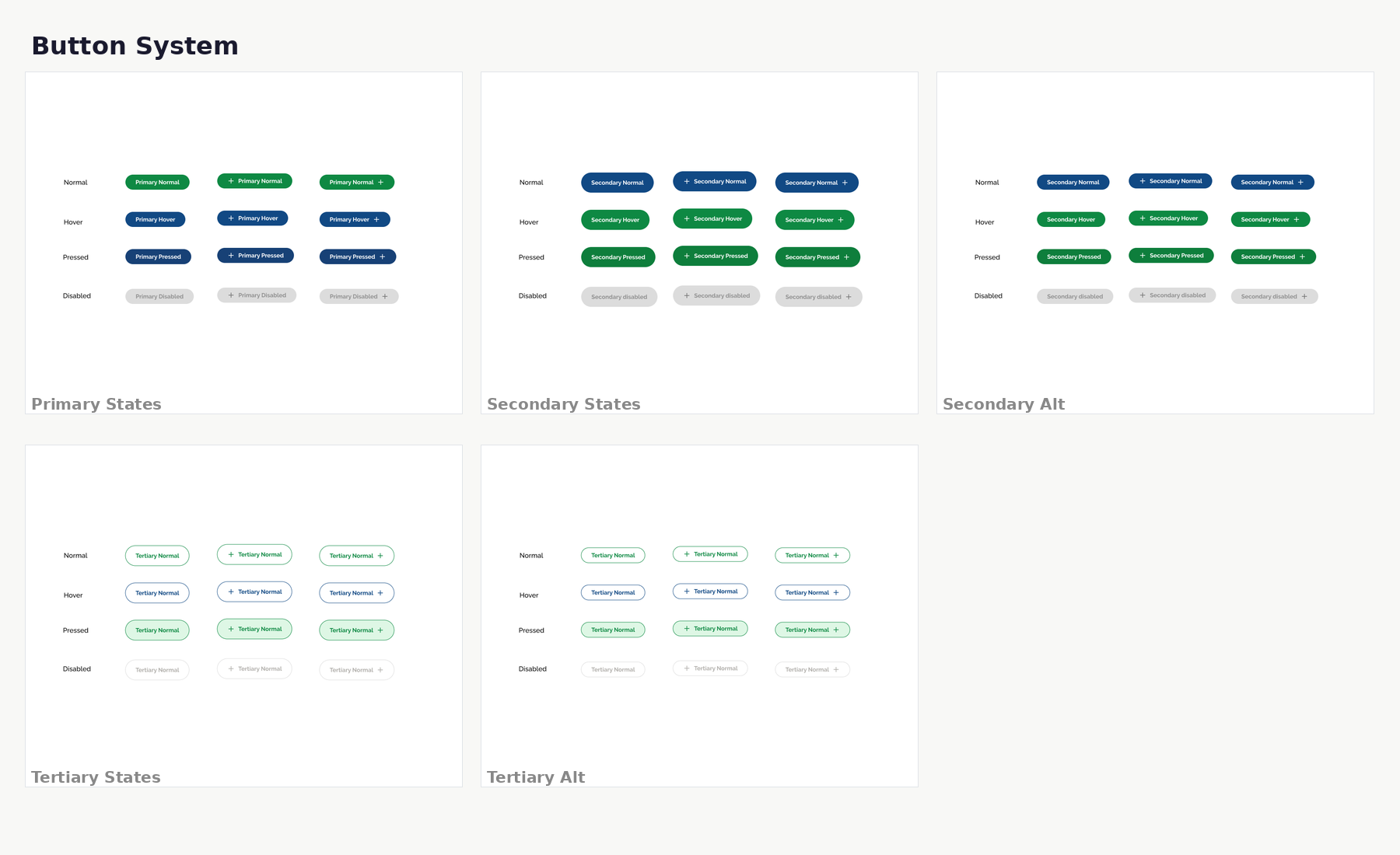
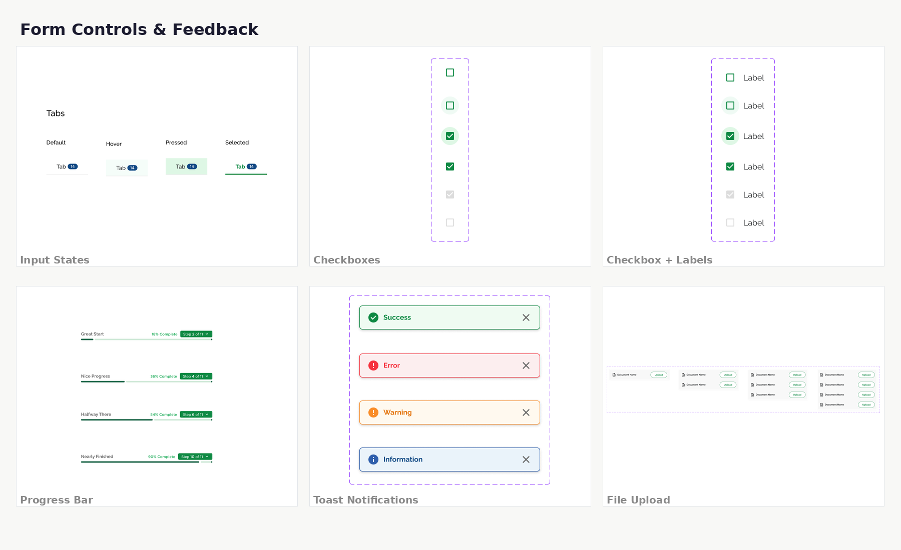
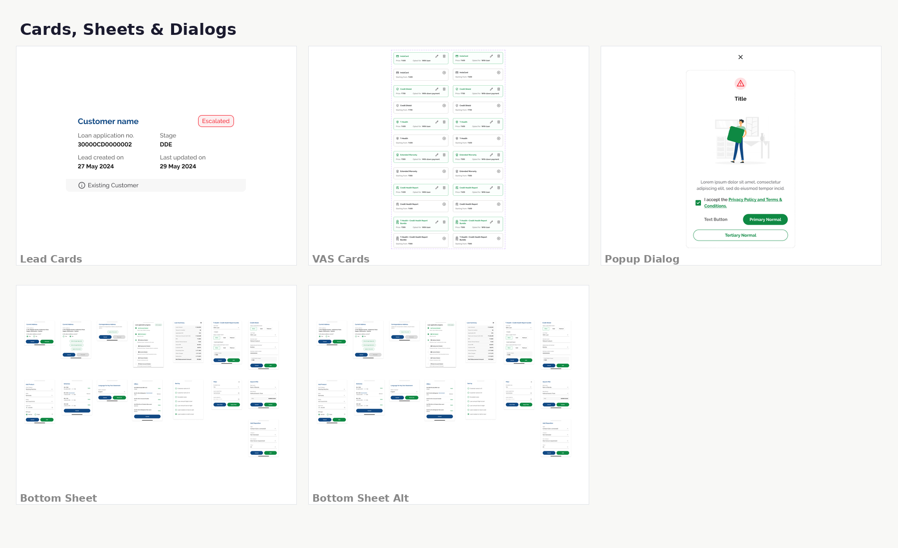
A component library built for scale, powering 6 products with consistent patterns
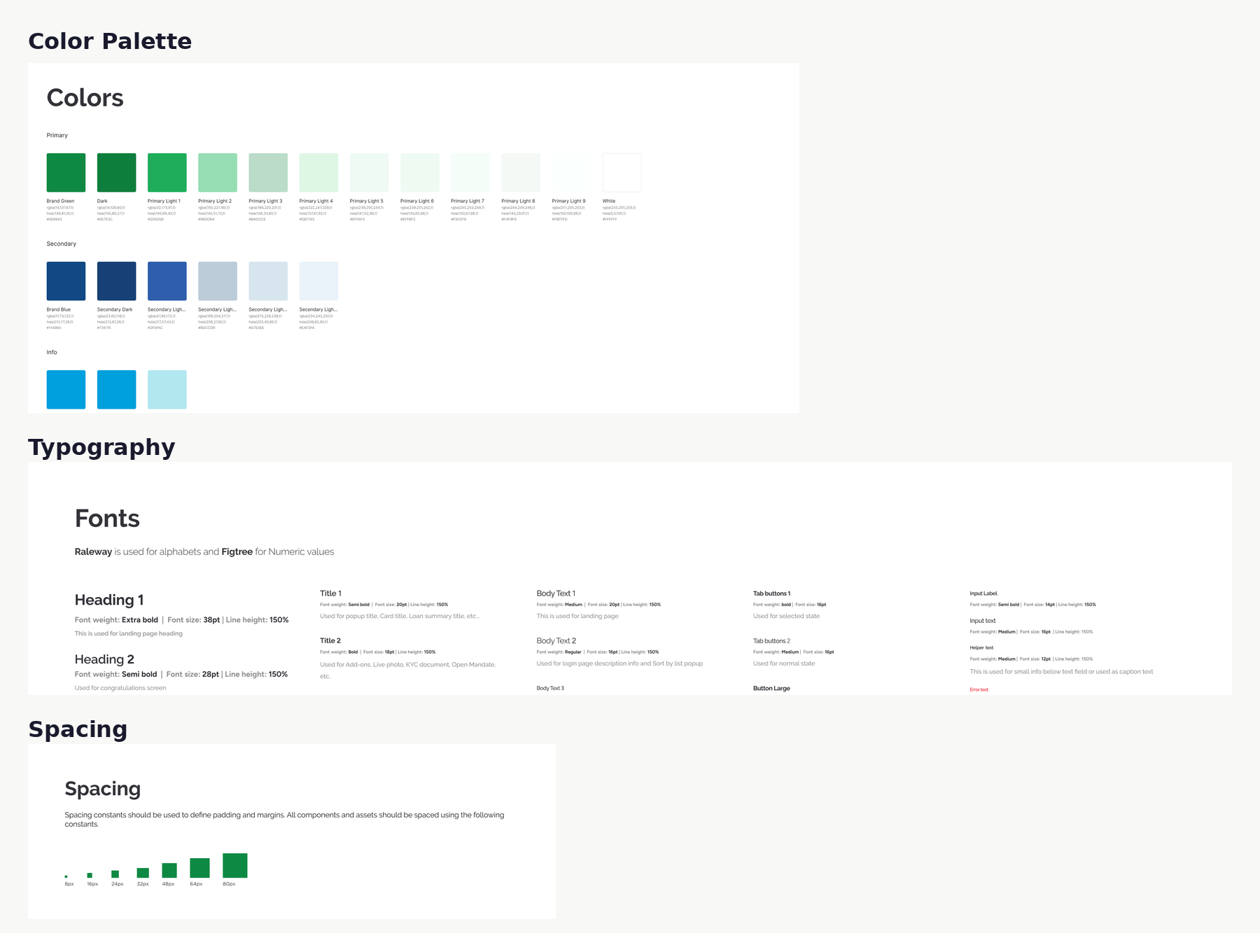
I created a comprehensive design system with 100+ components in Figma, establishing a shared visual language across all loan products. Built with auto-layout, variants, and design tokens for seamless developer handoff.
component library
100+ components organized into foundational tokens, form controls, navigation patterns, and content containers. Built in Figma with auto-layout, variants, and design tokens for seamless developer handoff.
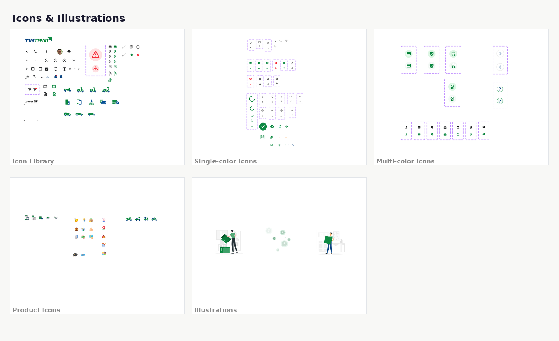
system impact
The design system enabled consistent experiences across 6 loan products while reducing handoff time. New product journeys could be assembled from existing components in days rather than weeks.
Five rounds of iterative prototyping, tested with real users before engineering handoff
Rather than a formal usability study, I took an iterative approach. I shared Figma prototypes with real users (sales executives, dealership agents, and customers), watched how they interacted, captured feedback, and refined the work across 5 distinct rounds.
- 1
Round 1: Internal Stakeholders
Shared initial wireframes with PM, business analysts, and engineering leads. This surfaced a core IA problem: scrollable multi-action screens were creating cognitive overload. Pivoted to a single-screen, no-scroll approach.
- 2
Round 2: Sales Executives
6 sales centre executives tested the mid-fidelity prototype. Key finding: agents couldn't locate the "back to edit" path. Added persistent edit icons on pre-verified fields and visible step-back navigation.
- 3
Round 3: Visual Design Review
Tested flat vs. 3D icon styles with stakeholders. 3D icons were engaging but added visual weight on data-heavy screens. Adopted flat icons with selective 3D for onboarding and empty states.
- 4
Round 4: Customer DIY Testing
5 first-time borrowers tested the high-fidelity prototype. The progress tracker confused them, so I added dual progress (percentage + step count). Vehicle selection icons were universally praised.
- 5
Round 5: Final Polish
End-to-end walkthrough with 3 existing customers. Refined "No, I want to update" button prominence, added benefit descriptions to add-on cards, improved error states for edge cases.
outcome
Through 5 iterations with 20+ participants, the design evolved from a scrollable, multi-action layout to a focused, single-screen journey that both agents and customers could navigate confidently. The final Figma prototype was signed off by all stakeholders before engineering handoff.
From paper to digital: measurable outcomes across speed, adoption, and consistency
key learnings & reflection
what went well
- No-scroll, single-screen approach eliminated form fatigue, and both agents and customers praised it
- Progressive disclosure reduced perceived complexity, so the 11-step journey "didn't feel long"
- Dual progress system kept users oriented without anxiety
- Building the design system early enabled rapid assembly of subsequent product journeys
- Close engineering collaboration during wireframing caught feasibility issues early
what I'd do differently
- Would involve sales executives earlier. Their deep insight only surfaced in Round 2 testing
- Should have tested on low-end Android devices sooner, since performance gaps appeared late
- Would design comprehensive error states from the start, because edge cases needed last-minute attention
- More A/B testing on add-on card designs before settling on the final pattern
All screens at a glance
Showing 10 representative screens from the Two-Wheeler journey. Toggle below to view all 47 screens.
thank you for reading.
Want to see what FinVista taught me applied to your product?