UX Case Study · Higher-ed Analytics · Power BI

Meridian Institute Analytics

One analytics platform for an entire university, built so leaders can read it in seconds instead of minutes

Role

Lead UX designer (UX + data viz)

Domain

Education tech

Platform

Power BI, Data Visualization and Data Analytics

What I owned

ResearchInformation architectureUI designDesign systemPower BI alignmentAI interaction patterns
4
Departments unified
~40
Legacy views replaced
14,722
Applications in one view
10+ yrs
Of history in one view
01 · TL;DR

in one minute

Meridian's leaders ran a whole university off a sprawl of disconnected Power BI reports that never talked to each other. The data was all there. They just spent more time hunting for it than reading it.

So I rebuilt it as one dashboard with five tabs: Overview, Undergraduate, Graduate, HR, and Research. One navigation, one visual language. The Overview tab is the cockpit that rolls the whole institution into a single read; each other tab drills into its own area, and every view defaults to multi-year trends.

Now a provost can land on the Overview and trust it, and an analyst can switch to a tab and pull a cohort apart. One dashboard, both jobs.

02 · Context and primary users

Context and primary users

Meridian is small, research-heavy, and split almost evenly between undergrad and grad (about 4,200 and 4,160 in Fall 2024). That split matters more than it sounds: any "total" quietly hides two different stories. Four domains, four owners, four dashboards that never spoke to each other.

One question, four files

Leadership thinks across domains. The tools didn't. A provost asks "is enrollment softening, is research strong enough to carry us, is headcount outrunning revenue?" in a single breath, and the old setup needed three separate sittings to answer it.

Every dashboard spoke its own dialect, too. The graduate school is international-heavy while undergrad is overwhelmingly domestic. Blend them and the number means nothing. So I split by level, by default, everywhere.

Two ways of reading, one product

People read this in two modes. Some glance: ninety seconds, give me the headline and anything on fire. Others drill: pull a pool apart by gender, country, test policy. The legacy tools dumped it all on screen at once, so the glance crowd burned their ninety seconds just figuring out where to look.

Who I designed for

I designed around six readers, from a provost who needs the headline in ninety seconds to an IR analyst who has to defend every number to the state. My bet: win the analysts who own the data, and everyone downstream inherits that trust.

Leadership & provost

Wants the whole institution in one glance: the headline across all four domains in ninety seconds, multi-year trends, and forecasts flagged as forecasts.

Enrollment management

The most demanding audience. Lives in the funnel: applied through to enrolled plus summer melt, yield by segment and source market, deposits tracked all summer.

Deans & program directors

Read their own house. Program-level demand versus capacity and clean slices by school, because a healthy total can hide one program quietly falling off.

Research office

A different rhythm. The funding pipeline and output, proposals, awards, and expenditures, read as multi-year series rather than a single snapshot.

HR leaders

Own their own data. Headcount, turnover, and academic mix, with workforce composition presented carefully.

IR analysts

Designed for first, on purpose. They need exact definitions, visible lineage, and mapping to the Common Data Set and IPEDS. Win them and everyone downstream inherits the trust.

03 · The problem

The problem: four dashboards that made you work before they told you anything

Core challenge

The data was never wrong. It just took too long to find, people spent about 90 seconds of every visit getting their bearings instead of reading. My job was to lead with the answer.

Four Power BI reports. Same maroon, but no shared layout, no shared filters, no shared chart language. Nobody ever said the data was wrong. They said it took too long to find what they came for, about 90 seconds of orienting every single visit.

So I audited all four against Nielsen's heuristics on a 0 to 4 severity scale, and tied every finding to a real person and a real task.

Four reports, four mental models

Undergraduate Admissions, Graduate Admissions, Research, HR. Four domains, four mental models, four visual languages. A provost who just wanted a Monday-morning read had to open four files and stitch the story together in their head.

What was actually broken

Everything showed at once, and nothing told your eye where to start.

The biggest miss was treating the whole institution as one population. Enrollment is near 50/50 (about 4,200 undergrad, 4,160 grad). "Percent international" is around 48% for grad but only 4% for undergrad, so a blended number is a lie with a decimal point. I segmented by level everywhere.

Why it hit this school harder

The story leaders most needed to watch was a tense one: applications fell from roughly 14,170 to 10,670, the admit rate climbed (43% to 51%), yield ticked up (17% to 21%). The old layout could not tell that three-variable story. The numbers lived on different tiles, in different styles, with no shared timeline. Some people had quietly stopped looking. The whole redesign was about ending the orienting and leading with the answer.

Before
The four legacy dashboards
The four legacy dashboards, four offices, four visual languages, no shared layout
04 · Research and domain landscape

Research and domain landscape

Before I drew a single box, I went and learned the sector. Every finding here turned into a design decision.

01

Where a dashboard actually sits

A dashboard like this sits at the very end of the university's admissions and student-records systems. The admissions CRM runs the funnels for about half of all universities, so every number starts there. I designed to what Power BI can actually show, and collapsed four legacy dashboards into one.

02

It's a trajectory, not a snapshot

Leaders watch where things are heading, not a single photograph. Meridian is the proof: fewer applications, higher admit rate, better yield, all at the same time. So every view defaults to a multi-year trend, pairs the funnel with yield, and labels projections as forecasts.

03

The enrollment cliff is regional

The college-age population is shrinking in the Northeast, Midwest, and West, and growing in the South. A Northeast STEM school feels that sharply. So geography is a first-class, drillable dimension: regional for undergrad, global for grad.

04

International share lies until you split it

The two levels are nothing alike, and a blended number averages two unrelated populations. So I segment by level everywhere. There is no global "students" view, on purpose.

05

Test-optional is reversing

Comparing yield across years now means comparing across policy regimes. So test policy is a dimension you can hold constant, not a footnote.

06

Post-SFFA, demographic data is sensitive

After the 2023 ruling, public release of disaggregated data dropped off sharply. So demographic views degrade gracefully when a category is suppressed, and they stay inside the platform.

07

Predictive analytics carries a real bias risk

In 2021, The Markup reported that EAB's Navigate used race to predict student success, bias shipped straight into real advising. So here, AI is a guide, never the decision-maker. Every output is a signal a human weighs, inputs visible, sensitive attributes kept out of the scoring.

What the research locked in

One product shape: a funnel paired with yield, then geography, program mix, demographics, and deposits. Built on Common Data Set and IPEDS, defaulting to multi-year trends, always split by level.

05 · Design principles

Design principles

Five rules did the deciding. If a screen broke one, it went back to grayscale.

01

Segment by level, always

Grad is ~48% international, undergrad ~4%. A blended mix describes a student who doesn't exist, so population mixes never blend across levels. The Overview may roll the funnel up; any mix or comparison only ever lives per level.

02

Lead with the answer

End the 90-second orienting. Headline first, drill second. Every screen names its takeaway before it shows the detail.

03

Design to what Power BI can show

Agree with the tool's limits before drawing anything pretty. Native drill-through, nothing custom the build team couldn't actually deliver.

04

Trends by default, deltas everywhere

One year tells you nothing. Every view defaults to a multi-year trend, and every KPI carries a year-over-year delta.

05

AI is a guide, never the decider

Human in the loop, inputs visible, sensitive attributes kept out of any scoring. Ask Meridian AI summarizes and explains what is on screen; it never scores a student, and people make the calls.

06 · Goals, success criteria, and process

Goals, success criteria, and process

What we were really fixing

The Institute had a reading problem, not a data problem. The numbers were right; they were scattered across four dashboards. Deans burned the first few minutes of every meeting hunting for the page, the filter, the current version.

The brief was not "prettier charts." It was: make these numbers fast to read and safe to trust, for people who open this between meetings and need an answer in under a minute.

What success looked like

I made success behavioral, not decorative. A first-time user names any screen's headline in about five seconds. A returning user answers a routine question with one filter change at most. One definition per metric. A forecast always reads as a forecast. And the analysts sign off that every number on screen means what their records say. That sign-off was the real acceptance test.

How I worked

Six passes, looping back often. The discipline I held myself to: agree with what Power BI can show before drawing anything pretty.

I audited the four legacy dashboards, mapped every idea to native behavior (drill-through, no custom workarounds), then collapsed them into one spine, grayscale first.

AI came last, on purpose. Ask Meridian AI is optional, audited for bias, human in the loop. A guide, not the decision-maker.

M MeridianFall 2024 cycleapplications + yield, 5 cyclesadmissions funnelundergrad rollupgraduate rollupresearch rollupHR rollup✦ Ask AI
screen 01

Overview, the institutional cockpit

M MeridianFall 2024 cycleapplications by schoolby geographyby roundby territoryinternational applications by country✦ Ask AI
screen 02

Undergraduate, Summary, with the world map

M MeridianFall 2024 cycleapplications, last four cyclesinternational by country, rankedby decision planby programby genderby geography✦ Ask AI
screen 03

Undergraduate, Application Totals

M MeridianFall 2024 cycledomestic vs internationalapplications by schooladmission funneltop 5 source countriesinternational applications by country✦ Ask AI
screen 04

Graduate, Summary, with the world map

M MeridianFall 2024 cyclecurrent headcountfamily group & time typegenderrace / ethnicityacademic population✦ Ask AI
screen 05

HR, Summary, plain and protective

M MeridianFall 2024 cycleactive / filled jobs and fall students by year✦ Ask AI
screen 06

HR, Trends Headcount, ten-year combo

M MeridianFall 2024 cyclefunded, awards, expenditures, 3 yractive and graduated PhD studentsfunding by school, small multiples✦ Ask AI
screen 07

Research, Summary, money over time

M MeridianFall 2024 cyclefaculty H-index by school, all timefaculty H-index by school, last 5 years✦ Ask AI
screen 08

Research, H-Index distribution

07 · Constraints I designed within

Constraints I designed within

Enterprise work, so the box was real before I drew anything. These shaped every call.

Power BI's native limits

I designed to native behavior, drill-through and standard visuals, nothing custom-built, so the team could actually ship it.

The data the university already has

The admissions system and the student-records system already owned every number. I designed to the data the university actually has, not an idealized one.

Post-SFFA data sensitivity

After the 2023 ruling, disaggregated demographic data is restricted. Those views suppress small counts and degrade gracefully when a category is withheld.

Scope honesty

The Overview is hi-fi; the other tabs carried through IA, greybox, and hi-fi. Designed and demonstrated, not shipped and measured.

08 · Information architecture and navigation model

Information architecture and navigation model

One product, one navigation model, one set of filters that behave the same everywhere. Shallow on purpose: an Overview cockpit up top, then four owner-aligned areas, each opening on a summary before you drill into named sub-views. Filters carry over, so the drill-down continues the question you were already asking.

Two calls shaped it. Undergrad and Grad stay split (not one "Admissions" toggle) because the funnels are genuinely different: international mixes worlds apart, volumes 2x apart. One layout would always look wrong for one of them.

And one rule runs through the whole thing: segment by level, always. No lone "total enrollment," no blended "percent international." Both would describe a student who does not exist.

Data sources

Slate

undergrad + graduate admissions

Student records system

enrolled-student records

Shared metric definitions

one meaning per number

Meridian Institute Analytics

one platform, one shared vocabulary

Overview cockpit

all four departments at a glance

Undergraduate

  • Summary
  • Geo
  • Funnel, yield, melt
  • Applicant segments

Graduate

  • Summary
  • Geo, source markets
  • Trends
  • Definitions

Research

  • Summary
  • Proposals
  • Awards
  • Expenditure, faculty

Human Resources

  • Summary
  • Headcount trends
  • Turnover trends
  • Workforce composition

Global filters (year, term, level, decision plan, cohort) carry across every screen, so a number always means the same thing.

01

Open Meridian

Land on the overview cockpit, no filtering needed.

02

Read the headline

Up or down, against last year and plan, anything on fire.

03

Open a module

Undergraduate, Graduate, Research, or HR, segmented by level.

04

Filter to a cohort

Program, geography, test policy, term. The funnel updates.

05

Act or export

Trigger outreach, flag a risk, or export for the board deck.

Leadership, steps 1 to 2

Glance, trust, leave. The cockpit has already done the thinking, so a provost gets the headline in ninety seconds without touching a filter.

Analysts & enrollment, steps 1 to 5

Drill all the way down. Same entry point, but they pull the funnel apart by cohort, check it against peers, and leave with an action.

09 · Design system and visual language

Design system and visual language

Four old dashboards, four layouts, one shade of maroon. I rebuilt them as one component set with one set of rules. Learn one page and you can read them all.

The vibe is calm, modern SaaS. Quiet chrome, so the numbers get the contrast. Foundations and the chart kit sit underneath; Ask Meridian AI is the one floating affordance, on top, never baked in.

Foundations

Light neutral canvas, soft cards, generous white space doing the separating. A geometric sans, plus mono for eyebrow labels and tabular KPI figures so numbers read like a ledger. One confident blue for emphasis, a fixed categorical palette, and status that means something: green healthy, amber watch, red risk. Maroon is a quiet brand note now, not a flood.

Maroon
#A32638
Navy
#004380
Blue
#4896CF
Orange
#E7842E
Gold
#E8B431
Green
#21BA45
Red
#DB2828
Ink
#1B1C1D
Light tints, for KPI cards
Light blue
#E7F2FB
Light orange
#FFF2E8
Light gold
#FFFAE6
Light gray
#F2F2F2
Display10,670
HeadingApplications by school
BodySegmented by level, every screen
Numbers14,170 · 21% yield · $52M
The component kit

Legacy decks leaned on pies nobody could read. I narrowed it to a small, reusable kit, one type per question, all aligned to what Power BI can render. Every component shares the same title, legend, formatting, and empty state, so a chart with no data says so instead of breaking, and a dean can drill from overview into a program without relearning the page.

KPI tile
14,170
▲ 3.1% vs last cycle
Sorted bars
Eng
Bus
Sci
Arts
Donut
Domestic
Intl
Other
Trend line
Admissions funnel
Applied
Admitted
Deposited
Enrolled
Data table
StateAppsYield
New Jersey2,21024%
New York1,98020%
Pennsylvania1,12022%
The AI layer

The brief asked for AI; the research made me cautious. The Markup reported in 2021 that a widely used product treated race as a predictor of student success, so my rule was simple: AI assists, it does not decide, and it never sits between a user and the numbers. The guardrails are the design, not a disclaimer. It shows up in three restrained places, and the test I held it to was this: delete the AI entirely and the dashboards are still complete and trustworthy.

Ask Meridian AI
Ask about any cohort or term…
Yield by programMelt risk
Next best action
Send deposit reminders to 41 India CS admits at risk.
Review list
Signals
NY / NJ deposits up 6% this week
Out-of-state interest up 9%, led by Texas
Dismissible, never blocking.

The conversational box is invoked, you ask and it answers; the next-best-action and signals run quietly in the background. Human-in-the-loop by default, every feature shows what it looked at, and sensitive demographics are never predictors.

Principles

Four rules that hold across all four departments.

Segment by level everywhere
Undergraduate, graduate, research, and HR never blur into one number.
Overview to detail
Every screen opens on the headline, then drills down on demand.
Squared, honest charts
No rounded bars, sorted and labeled, no legend hunt.
Flag forecasts as forecasts
Projected figures are visibly marked, never dressed as actuals.
10 · Inside the undergraduate and graduate tabs

Inside the undergraduate and graduate tabs

These two are the heart of the platform, and they both break the same rule: one number lies. Grad students are about 48% international, undergrads about 4%. A single Institute-wide "percent international" describes nobody.

So the rule came first: segment by level, everywhere. Each gets its own overview, geography, and funnel. Shared chrome, never shared data.

Undergraduate admissions

The undergrad story is a tension, not a headline. Over two years the funnel both tightened and loosened at once.

  • Applications fell ~14,170 to ~10,670.
  • Admit rate rose ~43% to ~51%.
  • Yield ticked up ~17% to ~21%.

Fewer applications, easier admit, slightly better yield. Every KPI carries a year-over-year delta, because "10,670 applications" tells a dean nothing and "down ~25%" starts a conversation. That single-cycle blindness is exactly what the legacy dashboards got wrong.

Graduate admissions

Graduate runs on a different engine: smaller pool, dramatic international skew, heavy loss between admitted and enrolled. So I built it around stage conversion, not multi-year trends.

The funnel makes the real problem legible: more than two thirds of admitted applicants decline. That gap, not the application count, is where the yield work lives.

With source markets concentrated (India by far the largest), that concentration is a risk as much as a strength. When one country supplies a big share of a class, a visa-policy change becomes an enrollment event.

Why I let the two diverge

One "admissions" template would have been easier. I chose not to. Undergrad is built for multi-year tension; grad for stage conversion and source-market concentration. The chrome, navigation, and the Ask AI affordance are shared so it still feels like one tool. The analysis splits because the two populations genuinely are different. That is the one call the legacy dashboards never made.

After
The Undergraduate tab, led by the international-applications map
After
The Graduate tab, where stage conversion and source-country mix come first
11 · Inside the research and HR tabs

Inside the research and HR tabs

Undergrad and grad are one pipeline. Research and HR are different animals. Research is a money-and-output story told over years; HR is a workforce story where the key numbers are also the most sensitive. Both legacy dashboards had the same flaws as admissions (maroon chrome, pie charts, tiny type), but the fix was different because the questions were different.

I kept the overview-and-drill-down spine, then changed the top-line KPIs, the time horizon, and how I handled demographic data.

Research Intelligence

This office does not ask "how many proposals this month." It asks "is the funding pipeline healthier than it was three years ago." So I led with money, over time.

The KPI band pulls apart three numbers people kept confusing: funding (new) ~$21.4M (did we win it), awards (active) ~$52M (what we manage), expenditures ~$35.5M (are we spending it). The legacy version split these across separate pies, so people compared slices and drew the wrong conclusion. Putting them side by side, one definition each, was the single highest-value fix.

The decade trend anchors the page: one year tells you almost nothing; the ten-year slope tells you growing, flat, or sliding. Output (publications, patents, H-index ~184) sits off to the side as the lagging proxy it is.

HR Workforce

HR needed the most restraint: do less, more clearly, and treat people's data with care.

The KPI band is deliberately plain: headcount ~1,363, split right away into faculty ~708 and staff ~655, two populations run by different rules. New hires and turnover sit next to it so headcount reads as a flow, not a still.

The body answers the three questions an HR leader actually asks: who we have now, how the workforce is changing, and who we have by demographics, faculty versus staff.

The demographic panels are where I designed most carefully:

  • Race/ethnicity and gender are composition, not performance. Nothing ranks or targets.
  • Small headcounts are suppressed or grouped. "100% of 3 people" is noise and a privacy risk.
  • No AI scoring here. Ask Meridian AI summarizes; it never predicts, ranks, or flags.

Why these two share a pattern

Both are longitudinal stories the legacy dashboards flattened into single-year pies. Both have a headline number that misleads on its own and only helps once you split it. Admissions taught me to lead with the funnel; these taught me to lead with the multi-year arc, and to know when not to compute at all.

After
The Research tab, money over time, output to one side
After
The HR tab, plain and protective
12 · Funnel, yield, and melt

Funnel, yield, and melt

The funnel is the whole job for enrollment leaders, so it sits right up top.

Five stages, plus a sixth most dashboards skip: summer melt, where yield quietly leaks out.

Why funnel and yield share a screen

One is meaningless without the other. Year one: applications fell 25%, but admit rate rose 43% to 51% and yield 17% to 21%. Narrower at the top, more efficient at the bottom.

The melt band

Real money that rarely gets a home. Showing deposited-versus-enrolled as its own delta gives leaders a number they can actually plan against.

After
The Overview cockpit, with the institutional funnel
13 · Geo intelligence

Geo intelligence

Geography is the second lens. "Percent international" means nothing until you split it by level, so each level gets its own map.

Undergraduate Geo

At 4% international, the domestic story is the story. I lead with a US map, because the enrollment cliff is regional and Meridian sits right in the Northeast.

Graduate Geo

International-heavy as it is, the source-market world map leads. The pipeline is concentrated, and that is the risk: one visa shift can move a whole class.

After
The world-map view, sized by application volume
14 · Before and after

Before and after

The fastest proof: the old pain on the left, the new answer on the right.

Tab by tab

Undergraduate Admissions. Applications fell 14,170 to 10,670, admit rate climbed 43% to 51%. A Northeast school feels the demographic decline harder, so geography earned its own screen.

Graduate Admissions. The worst of the pie problem. International share now splits by level instead of pretending one number covers both.

Research. A dense grid of fiscal-year tables became a proposals-to-awards pipeline with flagged trends.

HR. Headcount 1,363, 124 new hires. Glance up top, detail below.

What carried across all four

One platform, not four prettier reports. The same patterns everywhere: KPIs with deltas, trends by default, charts chosen for the question, one predictable drill path.

01
Clutter to hierarchy

A page of twelve equal weight tiles, where nothing is first. The fix leads with one headline KPI, then a trend, then the detail.

Before
Twelve equal tiles
After
Answer, then trend, then detail
4,052
Total applications
02
Pie overload to fit-for-purpose charts

A pie of near equal slices is hard to compare. The rule: shares stay donuts, comparisons become sorted bars, time becomes lines.

Before
Five near equal slices
After
Sorted high to low
Eng
Bus
Arts
Sci
Law
03
Navigation friction to overview and drill-down

Four disconnected pages with no links between them. One overview cockpit drills down into four modules. Nothing is a dead end.

Before
Four disconnected pages
After
Cockpit, then drill-down
Overview
04
Flat numbers to KPI with delta

A flat gray number, no prior year, no direction. The fix carries the value, a colored delta, an arrow, a sparkline, and vs last year.

Before
Flat number, no context
51%Admit rate
After
Value, delta, direction, trend
51%
Admit rate
8 ptsvs last year
05
Orienting time to reading time

A dense page spends its first 90 seconds orienting. The answer first page spends that time for the user, so it reads instead.

Before
Dense, spent orienting
90s orienting
After
Answer first, spent reading
90s reading
15 · How I validated, and what it should produce

How I validated, and what it should produce

No formal usability lab on this one, and I won't pretend otherwise. Here is what I actually leaned on, and the outcomes the design is built to produce.

Heuristic audit

I scored all four legacy dashboards against Nielsen's heuristics on a 0 to 4 severity scale, and tied every finding to a real person and a real task.

Analyst sign-off

The IR analysts who own and defend the data confirmed every number on screen means exactly what their records say. That sign-off was the real acceptance test.

Honest scope

Expert review and stakeholder sign-off, not a formal usability study. Validating task-times with real provosts and deans is the next step.

Expected UX outcomes, designed for, not yet measured

  • Faster executive scanning, the headline in seconds instead of minutes
  • Fewer dashboard switches, one platform instead of four separate files
  • Better KPI discoverability, one definition per metric, a delta on every tile
  • Consistent reporting, learn one page and you can read them all
16 · Outcome, reflection, and forward outlook

Outcome, reflection, and forward outlook

What came of it, what I would redo, and where Meridian goes next.

The funnel story, now legible at a glance

14,17010,670
Applications, over two years
43%51%
Admit rate
17%21%
Yield

What changed

Reads, not decodes

Pie-heavy, tiny-font layouts gave way to clear hierarchy and charts matched to the question.

Segmented by level

No blended numbers. Percent international is meaningless when grad is ~48% and undergrad ~4%, so every panel splits by default.

One common spine

Every metric traces to the Common Data Set and IPEDS, the shared backbone four ad-hoc dashboards never had.

Trusted by IR

The funnel and segmentation logic matched how the analysts already think, so they never had to re-translate it.

What I would do differently

Design inside Power BI's box

Every layout had to be buildable in Power BI. Next time I would pull a Power BI engineer into wireframe reviews earlier.

The AI is a promise, not a proof

Built human-in-the-loop with visible inputs, but none of it is bias-audited yet. That is the first work item.

Demographics on shrinking ground

Post-SFFA, far fewer institutions release disaggregated data, so those panels degrade gracefully when it is missing.

Scope honesty

The overview is hi-fi; the other seven screens carried through IA, greybox, and hi-fi. Designed and demonstrated, not shipped and measured.

Forward outlook, the next two to three years

AI becomes how you ask

Not a bolt-on. You ask in plain language and the right panel assembles itself, grounded in numbers that mean what they say.

Admissions data keeps getting closer to live

The data keeps moving closer to real time, so summer melt is something you watch as it happens, not something you find out about later.

Segmentation is the whole game

With the enrollment cliff coming, multi-year trends plus geo and policy segmentation is how you see it early.

UX maturity in the sector

Built for the provost and dean, not just data teams. Treat 'understood in five seconds' as a requirement.

The honest claim

The redesign makes the data clearer, faster to read, properly segmented, and trusted by the people who own it. The AI and the harder behavioral outcomes are designed for, not yet proven. Both are true at once.

✦ · The full walkthrough

One dashboard, five tabs

You've seen the parts. Here's the whole thing: the Overview cockpit, then the tabs it leads into, all on one design system.

After
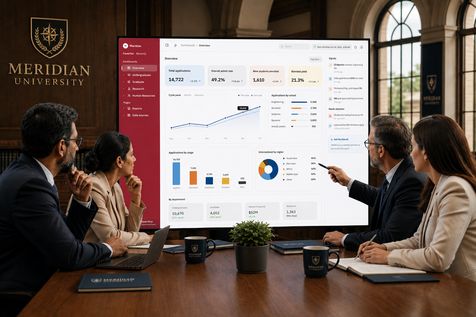
The Overview tab, the cockpit that rolls the whole institution into one read
After
Undergraduate, Summary, with the world map
After
Undergraduate, Application Totals, with the cycle trend
After
Graduate, Summary, with melt and concentration
After
HR, Summary, plain and protective
After
HR, Trends Headcount, ten-year combo
After
Research, Summary, money over time
After
Research, H-Index, faculty citation distribution
After
Research, Expenditures, brackets and PIs
AI
Ask Meridian AI, a rounded modal over the dashboard, not baked into the chrome

Thank you for reading.

Want this kind of clarity for your analytics product?

Faraz Khan

Senior UX Lead · Pune, Maharashtra · India

©2026 faraz khanmade with care, not with templates